Monday 14 December 2020

Alcohol Inks

This year, I decided to give alcohol inks a try.  I took a class that went over the basics.  It was very good.  That is something I would recommend as it's quite a different medium and there are some important things to know before using it.

Here are some pointers about using alcohol inks.

*Make sure you have really good ventilation.  The smell is quite strong and it would be easy to become light headed without having a window open and a fan to clear out the room.  Because of this, I have done alcohol inks outside.  I just have to make sure that it is a calm day and that I have room to set up everything.  

*I have used Staples brand photo paper.  It's affordable and readily available as it is easy to go through a lot of it trying out different inks.  I use the back side which doesn't have any printing on it.  I'm not sure if matters much as I have mistakenly used the front glossy side.  It still worked although I'm not sure it will adhere as well and not fade as much.

* I have bought white tiles from Home Depot.  I have bought the 6"x6".  They work really well and are certainly cheap.  

*I buy my canned air from the Dollar Store.  Sometimes it's tough to find and they often don't have a lot of it in stock.  I have found it in the business supply area, but asking the staff is sometimes necessary.  I use this as blowing through a straw can take a lot out of you if you have a lot to do.  The canned air works really well, but you can go through a can in a short period of time.

*Finding the sealing spray and the UV spray can be difficult.  I have lucked out and found some at Walmart in the art supply area.  I have used the Kamar Varnish and the UV Clear.  They work well.

There is a very active communities on Instagram.  Search for "alcohol inks"

Here are some of my pieces.


 This is on a black tile.


Saturday 17 June 2017

Gold Foil

I've been looking into trying gold foil in a painting.  I had bought some a few years back and really never gave it a chance.  This spring, I decided to delve into it.

I did a YouTube search on how to properly apply it and came across Nancy Reyner's videos.  They were a great resource and got me started.  Her paintings are beautiful and ethereal.

I used the Mona Lisa gold foil and adhesive.  It comes in sheets that are easy to use.  These are imitation gold and not gold leaf.  The real gold leaf is extremely expensive and not something I wanted to experiment with on a painting.  Also, Nancy Reyner uses gold foil in her video demos.  I ordered my supplies from Curry's in Canada as there is nothing available where I live.

In this package, each sheet is divided by a tissue and the foil is attached to a wax paper film.  This makes it easy to handle and to completely cover an area.


This is the adhesive that I used.  It brushes on easily and washes up with water.  I did't use the spray as it is not something I wanted to use in my home and using outside was too difficult.

For my first painting, I used a masonite board.  I prepped it with gesso to cover the brown of the board. After that, I applied a layer of modelling paste to give it texture.  I created a lot of high spots and some smooth spots.  Then, I applied the gold foil.  Using Nancy Reyner's suggestions, I let it dry for 3 days before the next step.

The foil needed to be sealed so that it wouldn't tarnish.  Using acrylic paints, I didn't want the ammonia in them to cause the foil to discolour.  I used GAC200.  This needs to be very thin when applied and then to wait until it's dry before adding another layer.  (10-15 minutes).  I put on 3 layers to completely seal the foil.

Then, I began to apply my paint.  I used different techniques when applying the paint.  I used a very watery paint to mimic watercolours in some areas, scraping on paint, sanding off paint, adding glass beads, and even adding iridescent paint.

Here is my painting.

Later on, I tried a small wooden cradle board for a painting.  I applied the gold foil, sealed it, and then put the acrylic on top of it.  I really had to make sure that I kept the foil free of paint to give it the sunset feel.  I like the glow that is has.


I enjoyed using the gold foil and will use it again.  Perhaps, next time, I'll try the copper foil or silver foil. 
I would like to try a larger painting on a cradle board along with the Pebeo prisme.  

Sunday 31 July 2016

Pebeo Prisme Paints

I came across Pebeo products when I was doing some research.  

Pebeo makes a number of different products.   They do make paints, but it seems that a lot of their products are for solvent-based media that can be used to create special effects.

I have only tried the Fantasy Prisme, so that's what I will review.

I picked up a sample pack from Michael's.   It included small pots of black, cream, purple, green, red, and gold.  I also picked up a larger pot of teal (not shown).  They are expensive and it is easy to use them up quickly, especially if you decide to just pour it onto a canvas.  I would say to try them on a small painting or area of it first.

When using these, there are a few things to remember.
     1.  Because these are solvents, they need to be used in a well ventilated room or    outside.  I would recommend outside as they have quite a strong odour.
     2.  I found a clear plastic 12" x 12" container that had a lid on it.  It was large enough to put in a canvas or a piece of watercolour paper.
     3.  Because this is very fluid, make sure that your surface is level.  Otherwise, it will flow in a way you may not want.
     4.  They need to be stirred well before using.  This is because they settle into the different components and need to be mixed before they can be used.  I used a popsicle stick.  Take your time doing this as if it is not mixed well, it may not produce the effect.
     5.  You can either pour this or use a dropper.  I had a small plastic disposable dropper.  I prefer this as I hate cleaning things out.  I figure that it was a small cost that I could handle.
     6.  I dropped the colour onto the surface and mixed it if I used more than one colour.   It needs to be put on thickly for the effect to be created, so you can't skimp.  You can tip it to get it to move and mix.  Once it begins to dry, I would leave it be.
     7.  Then, I let it sit.  I closed the lid to my container so that I wouldn't get any bugs into the solution. Periodically, I would check it to see the effect just by looking through the lid.  I left it outside on the table for a good 4 hours.  This allowed it to set up a bit before carrying it inside to my studio.  I then left it inside the container to completely dry.  This took about a full 24 - 36 hours.  It still had a bit of a smell to it.  

The effect that Prisme gives you is a honeycomb look.  I find it quite striking.  Below are a few of the sample pieces that I've done using it.  They are parts of paintings that I have used it in.


I would say to give them a try.  Perhaps later on, I'll give some of their other products a try.

pebeo.com


Sunday 1 May 2016

Autodesk Sketchbook App

Autodesk Sketchbook
This app has a Pro version, but I am going to review the free version for the iPad.
The free version offers 10 brushes, 3 layers, a number of blending methods, tools for symmetry, rulers, ellipses/circles, squares/rectangles, and text.  It also connects up with a variety of styluses through Wifi.

With the brushes, you can change the size and the transparency of the colour.  All of this uses a slider which actually shows the size and opacity.  This is really handy when working on something.
There are 2 erasers.  One is a hard edge and the other is a soft type.  They both have a slider to change the size.

Some things that I've found frustrating are:
      -with only 3 layers, you often have to merge them together in order to add more layers to things.

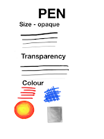
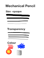
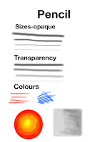
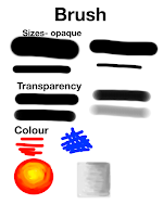
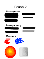
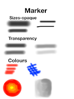
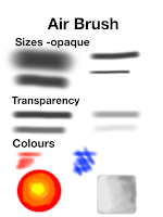
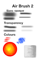
Below are examples of the brushes provided.  The sizes usually go from the largest to the smallest, except for the 2 brushes, the marker, and the 2 air brushes.  They were just too large to display.  


Below is the same type of painting as for Paper by fifty three.  I'll use this to display the similarities and differences of all the apps.


Tuesday 15 December 2015

Paper by FiftyThree app


This is the first drawing app I'm going to try.  I chose this one partly because it is free on the App Store.

Initially, when I did some internet research, this app could be used to create notebooks that then could be printed off like a Moleskin.  I thought that this might be something that would be neat if you had a number of sketches done while on a holiday.  It would be a nice keepsake.  Once I started to use it, I found that printing books like a Moleskin was no longer available (at least when I went to try it).  There is an option to print it yourself or save it as a pdf file.

This app has a limited number of tools that they have made free when you download the app.  It includes an eraser, a nib pen, a pencil, a marker, an ink pen, and a water-colour brush.  It also has a cutout tool, a roller, and a ruler tool.

It has a set of premix colours that can be chosen, or they can be combined to mix a unique colour that can be saved.  It works really slick and gives a wide range of colours.

Some things that I've notices are that there is no way to adjust the size of the various drawing tools.  I guess the only way would be to enlarge the image on your tablet and then use it for small items.

This is the tool bar.


Here is a quick cover design I did.  It think that the line down the side is to emulate the elastic of a Moleskin. The pre-made covers that are shown on the Paper website are no longer part of it.  When I contacted them, it was explained to me that they had to take those out to make room for other components.  I thought that I could perhaps import a photo to use, but that doesn't seem an option.  It looks like I might have to take a picture of something and then use it or create a painting on the cover.  


Below, I did a sample of each of the drawing tools to show what they do.  I did some lettering, underlining, a curved line, hatch marks, and a squiggle for each one as a comparison.


I did this using the Brush to show the range of tone when applying it over and over again.  It does maintain a watercolour effect.


The app provides grid paper, so I decided that I would make a colour chart of all their pre-made colours.  It was also a good exercise in using the stylus to carefully fill in the squares and to erase any colouring outside the lines.


They also have lined paper so I used the stylus to do some lettering.  I felt like I was back in elementary school doing a page of writing.  I have to say that I was pleased with how accurate the stylus was in being on the line itself.


Below are a sample of some of the other tools provided by Paper.


The cutouts allow for an odd shape to be drawn and then moved or taken out completely. 


The ruler tool allows for drawing like a pen, but it also gives perfectly straight lines and shapes.  This could be very handy when drawing buildings and horizon lines.  It's always tough to get those straight lines freehand.


The roller can be used to fill in large spaces as well as to create shapes.  It can create a leaf shape, petals, or swoops.


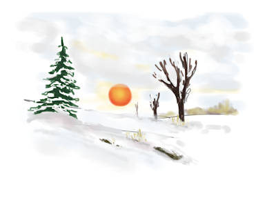
When I was out driving yesterday, there was a beautiful sunset.  I felt that I had to try to create a painting using it for inspiration.  I used the ink pen to initially put in the trees, then used the brush to add colour.  I did try the marker, but found it too harsh.  I found the app allowed me to blend colours with my finger after putting them on with the brush.  I was pleased with the result.


As I work with Paper, I'll continue to add in some thoughts and drawings.
I have found an excellent site for tutorials.
               https://mademistakes.com/mastering-paper/
               http://www.fiftythree.com/think
               http://www.fiftythree.com/pencil

Paper by 53 stylus

I am interested in doing some urban sketching, but would like to try doing digital sketches on a tablet.  I thought that this would be a good way to keep all my sketches and be able to transfer them onto my computer.  Up until now, I would have to scan the drawings onto it.  

I received an iPad and plan to try to create some sketches using it.  I know that there are number of apps that are available for drawing, sketching, and painting.  I'm not sure which app will be the best one for drawing on the pad, so I plan to get some of them and try them out.  I'll post what I'm doing to act as a comparison.

I am using the Paper by 53 stylus.  I chose this one after doing a bit of research.  I didn't want a stylus with the big squishy end on it.  I figured for sketching, it should be something that could be easier to know where the end is.  I looked at some of them that have the clear disk on the end, but was concerned about the disk scratching the tablet.  

I've tried to use the 53 stylus.   It is shaped like a carpenter's pencil.  I have just begun to use it and found it to be comfortable to use and good at knowing where that end is.  It comes with a replacement tip and eraser.  It is a rechargeable stylus.  The tip comes out to he pencil and has a USB charger on it.  It is designed to be used with the Paper by 53 app, but I'm going to see how it is with other apps as well.  With the Paper app, the stylus connects with Bluetooth.  The end of the stylus actually can be used as an eraser when using the app.  It's also supposed to recognize when your hand is on the tablet and not have it wreck your drawing.  So far, it seems to do all of that.


Thursday 12 November 2015

Acrylic painting

This fall, I took a class in acrylic painting.  We used different mediums such as light moulding paste and glazing medium.

These paintings were done using a palette knife and moulding paste.  I used the Golden paste.  I really enjoyed painting with it.  It gave each piece a lot of texture, which I like.

In this piece, I used the light moulding paste.  I also sprayed the bottom to smooth out the paint.  That way, I got the reflection which I was looking for.

These two pieces also used the method of spraying the piece with water to create an interesting sky.  It looks like rain.


We also worked on some portraits, which I'm still working on.  When I'm done them, I'll add them to this post.